Civ 7 UI: Is It Really That Bad?
- By David
- Apr 21,2025

Civ 7's Deluxe Edition has been out for just a day, yet the internet is already buzzing with critiques about its UI and other potential drawbacks. But is the UI truly as substandard as some claim? Let's delve into the specifics of the game's interface and evaluate the criticisms.
← Return to Sid Meier's Civilization VII main article
Is Civ 7's UI as Bad as They Say?
Civ 7 has only been available for a day to those with the Deluxe and Founder's Editions, yet it's already facing criticism, particularly regarding its UI and the absence of certain quality-of-life features. While it's easy to join the chorus of detractors, it's important to take a closer look and evaluate if the UI truly falls short of expectations. To do this effectively, we'll dissect the UI's components and assess them against the standards expected of a 4X game's interface.
What Makes a Good 4X UI?
Designing a 4X UI that universally pleases everyone is challenging due to the varied contexts, styles, and objectives of different games. However, experts in visual design have identified common traits among successful 4X UIs that can serve as benchmarks. Let's apply these standards to Civ 7's UI to see how it measures up.
Clear Information Hierarchy
A well-structured UI should prioritize the display of information based on its importance and frequency of use. In 4X games, this means placing commonly accessed data front and center, while ensuring less critical information is still easily accessible.
Take Against the Storm as an example, where building information is organized into tabs that prioritize the most frequently used actions, such as assigning workers and setting production parameters.
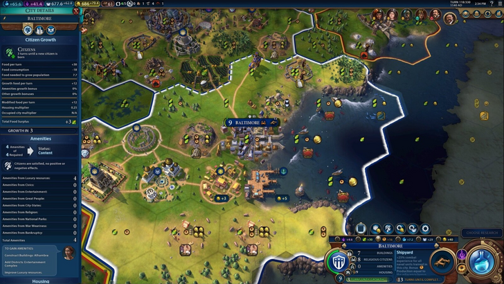
Now, let's examine Civ 7's resource management UI. It organizes data into income, yields, and expenses through dropdown menus, presented in a tabular format for easy tracking. While this setup is functional, it lacks detailed specificity. For instance, it doesn't pinpoint which specific districts or hexes are contributing to resource totals, and it only partially accounts for expenses. Though not the most effective, Civ 7's resource UI still serves its purpose and could benefit from greater detail.
Effective and Efficient Visual Indicators
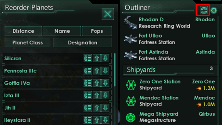
Visual indicators, such as icons and color coding, should convey information quickly and effectively, reducing the need for textual explanations. Stellaris' Outliner is a good example, using icons to show the status of survey ships at a glance.
Civ 7 employs iconography and numerical breakdowns for resources, supplemented by visual indicators like the tile yield overlay and settlement overlays. However, the absence of certain lenses that were present in Civ 6, such as those for appeal and tourism, has drawn criticism. While not disastrous, there's clear potential for improvement in this area.
Searching, Filtering, and Sorting Options
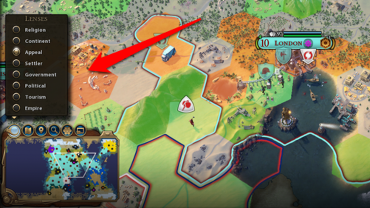
As 4X games grow in complexity, the need for robust search, filtering, and sorting capabilities becomes essential to manage the influx of data. Civ 6's search function, which allows players to locate specific map elements quickly, is a prime example.
Unfortunately, Civ 7 lacks this feature, which has been a significant point of contention among players. This omission is particularly felt given the game's expansive scale. Adding a search function in future updates could significantly enhance the UI's usability.
Design and Visual Consistency
The aesthetic quality and consistency of a UI play a crucial role in player engagement. Civ 6's UI, with its dynamic cartographical style, seamlessly integrated with the game's overall visual theme.
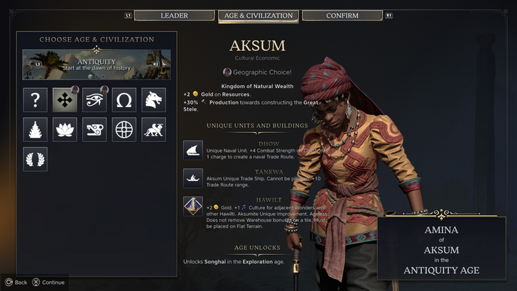
Civ 7, conversely, opts for a more minimalist and refined aesthetic, using a sleek design with black and gold tones. While this choice aligns with the game's sophisticated theme, it's less immediately engaging and has led to mixed reactions. Visual design is subjective, but Civ 7's approach has not resonated as strongly with all players.
So What’s the Verdict?
It’s Not The Best, But Undeserving of Such Disapproval
After evaluating Civ 7's UI against established benchmarks, it's clear that while it has its flaws, it's far from the disaster some claim. The missing search function is a notable omission, but not a deal-breaker. Compared to other issues the game might face, the UI's shortcomings are relatively minor. While it may not stand out as visually or functionally as some other 4X UIs, it still has merits.
Personally, I find the rest of the game compelling enough to overlook the UI's imperfections. With future updates and player feedback, Civ 7's UI has the potential to improve significantly. For now, it's not as bad as the internet suggests.
← Return to Sid Meier's Civilization VII main article
Sid Meier's Civilization VII Similar Games

Latest News
more >-

-

- GTA 6 May Feature Cameo by DJ Khaled
- Apr 03,2026
-

-
-